GO TO THIS BLOG INSTEAD:


'Cause I don't blog here no more.

See you there,

-Jake

FANART FRIDAY: PAUL POPE


Ain't no comic like a Paul Pope comic 'cause a Paul Pope comics gots style.

FANART FRIDAY: TAIYO MATUSMOTO


This is how I came to know Taiyo Matsumoto:


When I was sixteen, in Hattiesburg, Mississippi, the Books-A-Million was the place to BE. It had snacks, coffee, more books than any of us could ever read, and was open 'till the obscenely late hour of 11pm, my then curfew. Angsty clots of my peers hung out in front of the store until closing, clad in punker and thrift-store goth regalia. It was where the conspicuously unhappy went to see and be seen.


I'd go, chat up the peeps, pay my respects to the tragic teen royalty out front... and then it was BUSINESS TIME. I read every art book, graphic novel, tankobon, and trade paperback on the shelves. Multiple times. And I bought as many as my minimum-wage job pushing popcorn at the local movie theatre could provide me. It was great. I'd show up with friends at around seven, or by myself after work, and read comics sitting on the floor 'till closing time.


It's still my idea of a good time.


In my uniform white shirt and bowtie in a mega-chain bookstore, I met Neil Gaiman, Nate Powell, Adrian Tomine, Chris Ware, Jack Kirby, Kevin Huizenga, Katsuhiro Otomo, Tite Kubo, and Taiyo Matsumoto.


I found Matsumoto's No. 5 on the bookshelf one night at around ten-thirty. I read it cover to cover, was thoroughly amazed by it's contents, but found myself low on funds. I'm terrible at managing my money. Still. Anyway, by the time I came back with enough cash to bring home the most original comic I had ever read in my entire life...


it was gone.


I couldn't remember the name of the comic or the artist, and didn't chance into any Matsumoto work again until, seven years later, I rented Tekkonkinkreet from Blockbuster on a whim. It was the same bizarre, surreal, wholly unique experience I'd had on the blue carpet in Books-A-Million. That time I wrote down the name.

The Anthology Project Vol. 2


I'm in it.

So's this guy.


Pre-order it

Color in Comicsology


Spread for Hawaiian Dick, written by B. Clay Moore.

Color in comics is probematic. A lot of great cartoonists avoid color entirely, and their work is stronger for it. Some of the greats feel that color doesn't have a place in comics at all, that it pollutes the experience. I don't know that I'd go that far, but most of what I've got on my shelf is black and white. This isn't because I think that color in comics is a bad idea, or that it pollutes the experience.

It's just absurdly difficult to make color work in the medium.

A single color illustration is a difficult thing to manage. The color needs to express and suggest the illustration's message, manipulate the viewer's emotions, and please the viewer enough that they want to look at it.

In comics, the problem is compounded by the number of illustrations on a page. Because each panel is a unique illustration with it's own mood, purpose, and context, the color in each panel needs to serve a function specific to itself. Unlike a single illustration, however, the individual panels must also work together on the page to maintain a larger color harmony between panels and even pages so that the the spread remains pleasing to the viewer as a whole. Expanding color harmony even further helps to tie the story together visually, and give mood to the work as a whole, rather than just a panel or even just one spread. But then the range of color available to express emotion in any given panel is further limited, and storytelling becomes more difficult.

In this spread, I tried to solve the problem by subjugating my other panels to the splash page on the left. I did my best to articulate the emotional and narrative content of each individual panel within the chromatic range I established in the splash. Storytelling within the limits of color harmony.

Hopefully, I'll find newer, more creative solutions to the problem. Some of my friends do really grand stuff with very limited color, which is a really elegant way to conquer the beast. I like a broad range of color in my work, but that puts me at odds with myself. The more ground you give it, the more complicated your palette, the closer color comes to swallowing you whole and ruining your work.

Freakin' comics.

FANART FRIDAY: SAM HITI's DEATH DAY

It's great.
Read it here.
Read about it here.

THIS IS ONLY A TEST

I am working on a long-format story. I've got a lot of it planned and sketched out, but I still don't know how I want the finished story to look... this is a style test. It's wrong, somehow. There's a tiny layer of polish between these drawings and the drawings I see in my head.

I'll get there.


A PLAN IS LAID

I want my comics to have the same spontaneity and life that my sketches do.

But I don't know how...


UTTERLY UNUSEABLE

I need me a demon for a comic. And I'm trying to find him. I accidentally found these little guys instead. I wish I had a story for them, 'cause they are (believe me) SO FUN TO DRAW, but they are useless little dudes. Maybe one day.


FRITZ IN THE CITY


ABORTION


Still figuring this whole comics thing out.

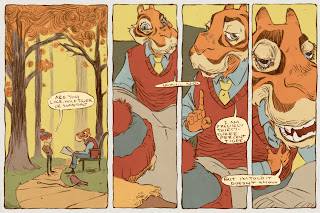
I drew this comic, I drew this whole comic, and scanned and composited and finished this whole comic. And then I HATED IT. So you may not see it. But I thought this was a good drawing.

I'm finding out that Good Drawings (whatever that means) do not Good Comics make. And I suppose that a drawing is only 'good' or 'bad' in whether or not it serves the comic of which it is a part. A single image or panel can be an elegant, immaculately executed piece of craft, but if it doesn't work with the comic as a whole, it is still a BAD drawing, and should be hit on the nose with a newspaper.

I mean, 'good comics' is a really vague, subjective term, too. I feel like when I started the short, I KNEW what I wanted to convey, but by the time I was done with it, so many little things had distracted me from that objective that it came out a little muddy.

I want to draw this again, as a more FOCUSED piece of work. Then I'll let you see it. Promise.

A Neville the Tiger Mystery


COMICSOLOGY

The study of comics.